Landing Pages That Convert: Best Practices for 2026
If you are driving paid clicks or SEO traffic in 2026, your landing page is no longer just “a page with a form.” It is a conversion system that must load fast, match intent precisely, earn trust in seconds, and still measure performance responsibly in a privacy-first world.
Below are modern, field-tested landing page best practices you can apply whether you are a local service business (plumber, dentist, electrician, clinic) or a B2B team generating leads through Google Ads, Meta Ads, and SEO.
What’s different about landing pages in 2026
Several trends have moved from “nice to have” to “table stakes”:
- Higher expectations for speed and UX: Users abandon slow pages quickly, and performance issues also hurt campaign efficiency. Core Web Vitals and real user performance remain central in Google’s ecosystem (see Google’s overview on Core Web Vitals).
- Privacy and measurement constraints: More traffic is harder to measure perfectly due to consent requirements, browser restrictions, and platform changes. Your page must be built to capture first-party signals ethically.
- Trust inflation: Users are more skeptical, especially for high-consideration services (health, finance, legal, home services). Proof and transparency win.
- AI-assisted browsing and summaries: People arrive with stronger preconceptions after reading AI summaries, reviews, and comparisons. Your landing page must confirm they are in the right place immediately.
Start with message match, the fastest conversion lever
“Message match” means the promise in your ad, email, social post, or organic snippet is repeated and clarified on the landing page.
If someone clicks an ad that says “Emergency plumber in Oslo, 30 minute response,” and your landing page opens with “Welcome to our company,” you have already lost momentum.
The 5-second test
A good landing page passes this simple test: within 5 seconds, a new visitor can answer:
- What is this?
- Is it for me?
- What do I get?
- What do I do next?
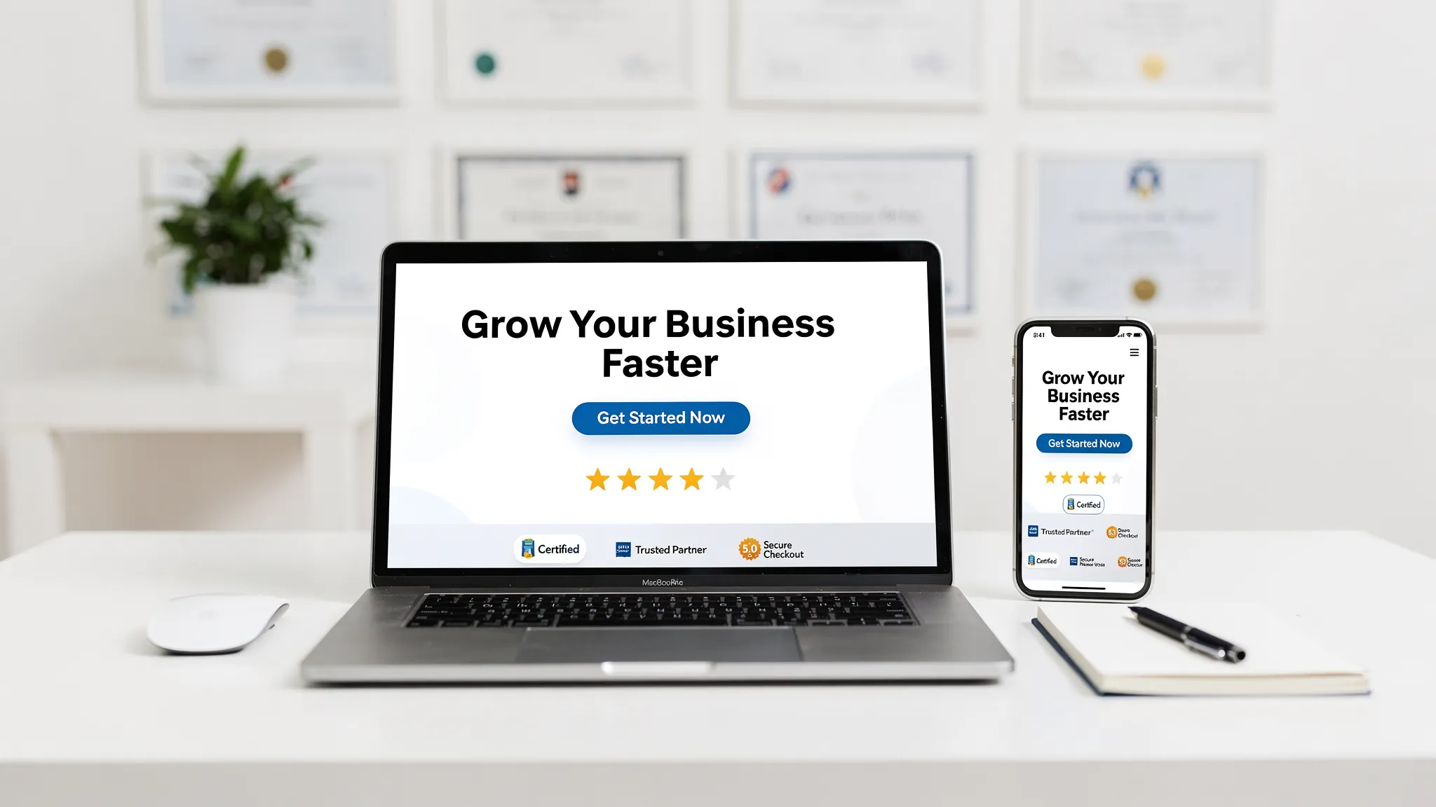
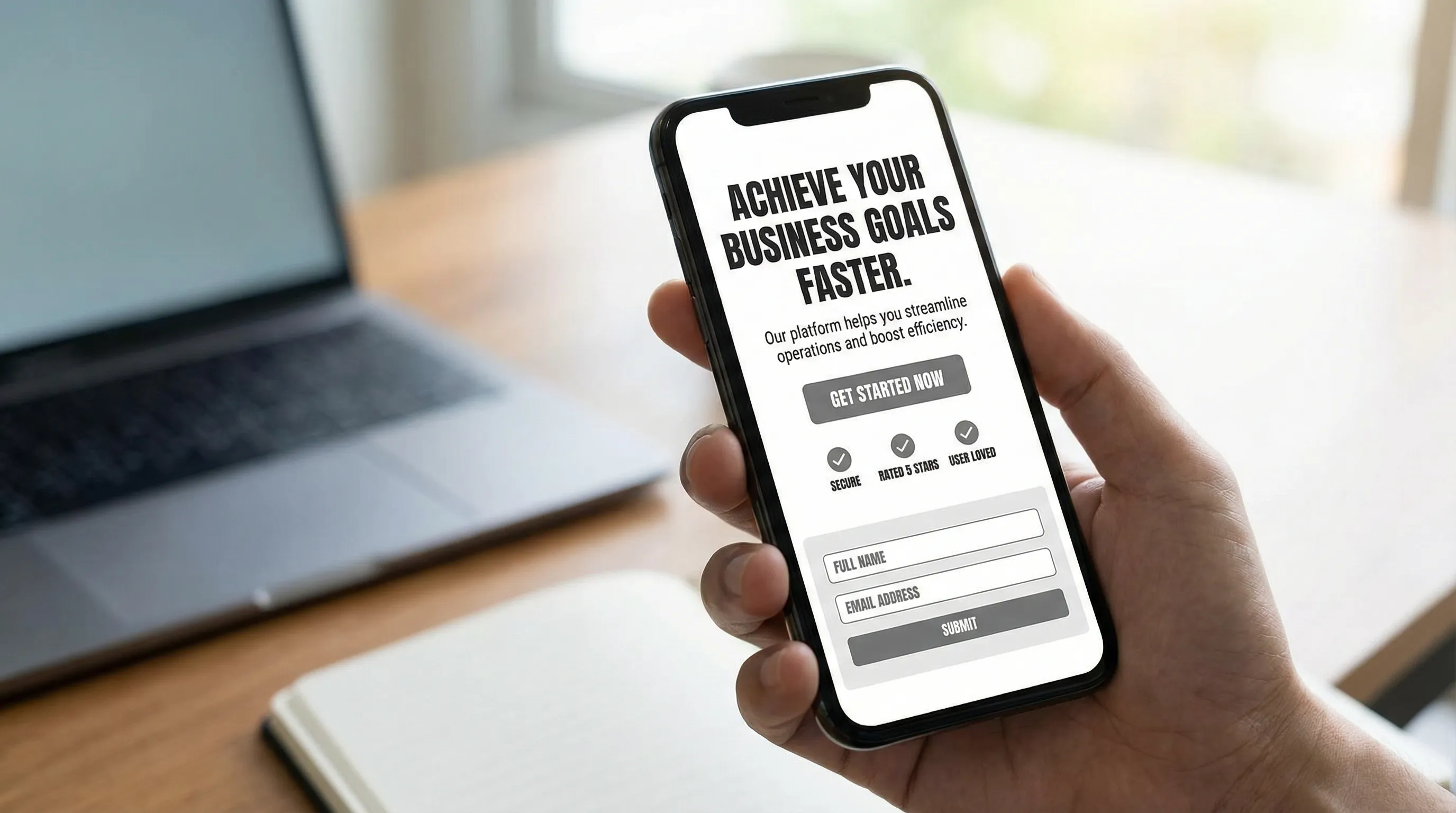
A practical structure for the top section (above the fold):
- Headline that mirrors the offer and the target (location, service, niche)
- Subheadline that reduces uncertainty (timeline, warranty, “licensed and insured,” “same-day appointments”)
- Primary CTA that matches intent (Call, Book, Get quote, Check availability)
- One proof element (rating, testimonial snippet, accreditation, number of projects, response time policy)
Align the page to search intent (TOFU, MOFU, BOFU)
A “best” landing page depends on intent. In 2026, many campaigns fail because the page is built for the wrong stage.
| Visitor intent | What they are trying to do | Landing page focus | CTA that usually works |
|---|---|---|---|
| High intent (BOFU) | Pick a provider now | Availability, pricing anchors, proof, fast contact | Call now, Book, Get quote |
| Comparison (MOFU) | Evaluate options | Differentiators, process, case studies, FAQs embedded in sections | Check availability, Get estimate |
| Problem-aware (TOFU) | Understand the problem | Education plus soft conversion | Get guide, Request consultation |
For local businesses running Google Search Ads, you typically want BOFU-first pages (fast path to contact) with just enough detail to reduce doubt.
Write conversion copy that reduces risk (not hype)
In 2026, visitors can detect “marketing voice” instantly. The winning approach is clarity and specificity.
Copy principles that consistently lift conversions
- Specific beats clever: “Same-day boiler repair in Bergen” beats “Comfort you can trust.”
- Concrete process beats vague reassurance: Explain what happens after they submit.
- Objection handling beats feature lists: Address common fears (hidden fees, long wait times, upsells).
Instead of “We offer high-quality service,” try:
- “You get a fixed-price quote before work starts.”
- “Average response time during business hours: under X minutes” (only if you can truly support it).
- “We clean up before we leave, and you can inspect the work with us.”
Make the CTA match the user’s mental commitment
A page that asks for too much too early loses leads. If you need to qualify leads, do it progressively:
- First conversion: “Check availability”
- Second step: collect details
This reduces perceived effort and often increases completion rate.
Design for mobile-first, thumb-first behavior
Most local-intent traffic is mobile. Your mobile layout should not be a cramped version of desktop.
Mobile UX elements that matter
- Sticky CTA for call or booking (especially for urgent services)
- Large tap targets and readable font sizes
- Short forms with the right keyboard type (phone keypad for phone fields)
- No visual clutter above the fold
Also consider context: a user searching “tow truck near me” may be on the roadside. Your landing page should behave like a fast utility, not a brochure.
Speed is a conversion feature (and a budget feature)
Every extra second of load time increases friction and can raise your cost per lead by lowering Quality Score signals and on-page engagement.
Use:
- PageSpeed Insights to spot performance bottlenecks
- Image compression and modern formats
- Fewer heavy scripts, especially chat widgets and multiple trackers
In 2026, a common mistake is layering tools until the page becomes slow and unstable. A lean stack wins.
Build trust like a regulated business (even if you are not one)
Trust is not a footer logo wall. It is a sequence of micro-confirmations.
The trust stack (what to add, and where)
Above the fold
- One credibility cue: rating snippet, association, guarantee, or a well-known client logo (only if true)
Mid-page
- Short testimonials tied to outcomes
- Photos that prove reality (your team, your work, your location)
Near the CTA
- Clear expectation setting: response time, what happens next, refund policy, cancellation policy
This is especially important for sensitive categories. For example, a mental health practice needs clear service boundaries, clinician credentials, and privacy cues, similar to how a provider might present comprehensive psychiatric services in NYC with an emphasis on multidisciplinary care and patient options.
Don’t hide the “boring” details
In 2026, transparency converts:
- Service area
- Hours
- Pricing model (fixed price, estimates, from-price anchors)
- Licensing and insurance (for trades)
- Data handling and consent (for lead forms)
Forms that convert in 2026: fewer fields, smarter flow
Your form is your conversion bottleneck. Optimizing it often beats redesigning the entire page.
Form best practices
- Ask only for what you will actually use to contact and qualify
- Use one column layout
- Provide error messages that explain how to fix the field
- Consider step forms only if they are faster on mobile (bad step forms feel like traps)
When you should add friction
Adding friction can increase lead quality when:
- You are capacity constrained
- You sell high-ticket services
- You get spam or poor-fit inquiries
Examples of “good friction”:
- A required “Service needed” dropdown
- A “Preferred time” selector
- A simple budget range (only if appropriate)
Personalization, use it carefully and ethically
Personalization can lift conversions, but it can also feel creepy or break measurement.
Safer personalization patterns for 2026:
- Location-based headline (when the user explicitly searched a location)
- Service-based variant (each service has its own landing page)
- Returning visitor recognition without personal data (“Welcome back, continue booking”)
Avoid personalization that implies you know private information.
SEO and landing pages: stop treating them as separate assets
Many businesses still build “SEO pages” and “ad landing pages” separately, creating inconsistent messaging.
In 2026, strong pages often do both:
- They answer the query clearly for SEO
- They focus the conversion path for paid traffic
On-page SEO essentials that also help conversion
- One clear H1 that matches intent
- Supporting sections that answer “how it works,” “pricing,” “service area,” and “why choose us”
- Descriptive internal links (avoid “click here”)
- Schema markup where appropriate (LocalBusiness, Service), implemented carefully
If your page is purely a thin form page, it may convert paid clicks but underperform for organic search and AI-driven discovery.
Measurement in a privacy-first world (without breaking trust)
Perfect attribution is rarer. Your goal is reliable directional data.
What to implement
- Consent-aware analytics and ad tags (for example, Google’s Consent Mode)
- Server-side tracking where it makes sense (and where you can do it compliantly)
- Clear conversion definitions: lead, qualified lead, booked call, sale
Track quality, not just volume
A landing page that doubles leads but halves close rate is not an improvement.
Align marketing and sales (even if sales is just you) around:
- Lead to appointment rate
- Appointment to sale rate
- Average revenue per lead
A/B testing that actually works
In 2026, the biggest testing mistake is running too many tiny changes without a hypothesis.
A better approach:
Test the big levers first
- Offer framing (free estimate vs fixed-price inspection)
- CTA wording (Book vs Check availability)
- Proof type (reviews vs case study vs guarantee)
- Form length and flow
Keep the rest stable
If you change headlines, layout, images, and form all at once, you will not know what drove the result.
Also, do not ignore “false wins.” Seasonality, promo timing, and traffic changes can make weak tests look successful.
Landing page checklist for local businesses (Norway and US)
Use this as a practical audit before you buy more traffic.
| Area | What “good” looks like in 2026 | Common mistake |
|---|---|---|
| Message match | Headline repeats the search/ad promise | Generic headline and stock hero |
| CTA | One primary action, repeated logically | Multiple competing CTAs |
| Mobile UX | Tap-friendly, fast contact, sticky CTA | Desktop design squeezed onto mobile |
| Trust | Proof near CTA, transparent details | Reviews buried on a separate page |
| Speed | Lean scripts, compressed media | Too many widgets and trackers |
| Forms | Minimal fields, clear next step | Long forms with vague errors |
| Measurement | Consent-aware, quality tracked | Only tracking “form submit” |
Where Kvitberg Marketing fits (if you want help)
If you are a local business that needs a conversion-ready web presence, Kvitberg Marketing builds pre-built, professional, SEO-optimized websites for free with no upfront commitment, then you only decide to buy after seeing the finished site.
That model can be a strong fit if you want a modern site that follows landing page best practices without gambling on a costly build before you see results. If you also want more demand after the site is live, Kvitberg can optionally support growth through services like SEO campaigns and Google Search Ads management.
The smartest next step is simple: decide what your highest-intent service is, then build (or rebuild) one landing page around that single offer, with speed, trust, and measurement designed in from the start.